

Chronic Health Condition Management Tool
Assisting Seattle’s aging and disabled communities to work with health care providers and take charge of their health.
Project Overview
Duration
20 Weeks
Team
1 Designer
2 Developers
1 Project Manager
My Role
2 Developers
1 Project Manager
UX Designer
UX Researcher
Tools
Figma
Adobe Photoshop
Responsibilites
Conducting interviews
Conducting usability studies
Wireframing
Low and high-fidelity prototyping
Adobe Photoshop
Conducting interviews
Conducting usability studies
Wireframing
Low and high-fidelity prototyping
Context
This project was sponsored by City of Seattle - Aging and Disability Services (ADS)
Over the course of 20 weeks our team would meet with ADS stakeholders to discuss requirements, provide updates, set up interview and testing environments, and arrange project hand off.
Design Challenge
ADS tasked the team with converting their paper-based Chronic Illness Self-Management plans into a digital product that could be implemented into their website.
Design Opportunity
Design an application for users of ADS' self-management system that provides them the ability to assess their chronic health condition and share results with health care providers.
Solution
An accessibility focused web application where users can answer questions about their chronic health condition, receive feedback on how well they're managing, and be provided with a report that can be shared with health care providers.
Over the course of 20 weeks our team would meet with ADS stakeholders to discuss requirements, provide updates, set up interview and testing environments, and arrange project hand off.
ADS tasked the team with converting their paper-based Chronic Illness Self-Management plans into a digital product that could be implemented into their website.
Design Opportunity
Design an application for users of ADS' self-management system that provides them the ability to assess their chronic health condition and share results with health care providers.
Solution
An accessibility focused web application where users can answer questions about their chronic health condition, receive feedback on how well they're managing, and be provided with a report that can be shared with health care providers.
An accessibility focused web application where users can answer questions about their chronic health condition, receive feedback on how well they're managing, and be provided with a report that can be shared with health care providers.
Understanding the user I worked with ADS staff to set up and conduct interviews with their patients which allowed me to better understand user needs and how my designs would meet them.
The primary user group identified through research was aging adults with chronic health conditions that experience impaired eyesight and motor function.
This user group confirmed several challenges faced when using the paper-based system and provided insight into overcoming those challenges in my design.
Findings
1. Confusion
Seniors were overwhelmed and confused by the amount of text, question fields, and icons on the page. This would cause them to read over the document several times.
2. Accessibility
Small font size combined with small entry fields and checkboxes caused seniors to struggle with readability and accuracy when providing answers.
3. Information Architecture
The documents featured heavy amounts of text combined with poor typography, resulting in poor readability. Seniors viewing the document found it difficult to separate the sections.
User Persona & Problem Statement
Alice is a senior adult who needs to assess her chronic health condition and work with her health care provider to form an appropriate management plan.
User Journey Map
Scenario: Alice wants to assess how well she is managing her Parkinson’s Disease. She begins at the ADS website landing page:

Starting the design
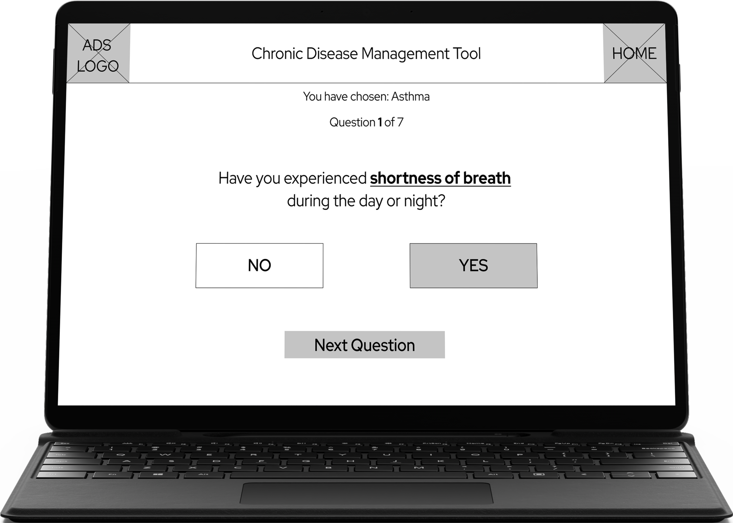
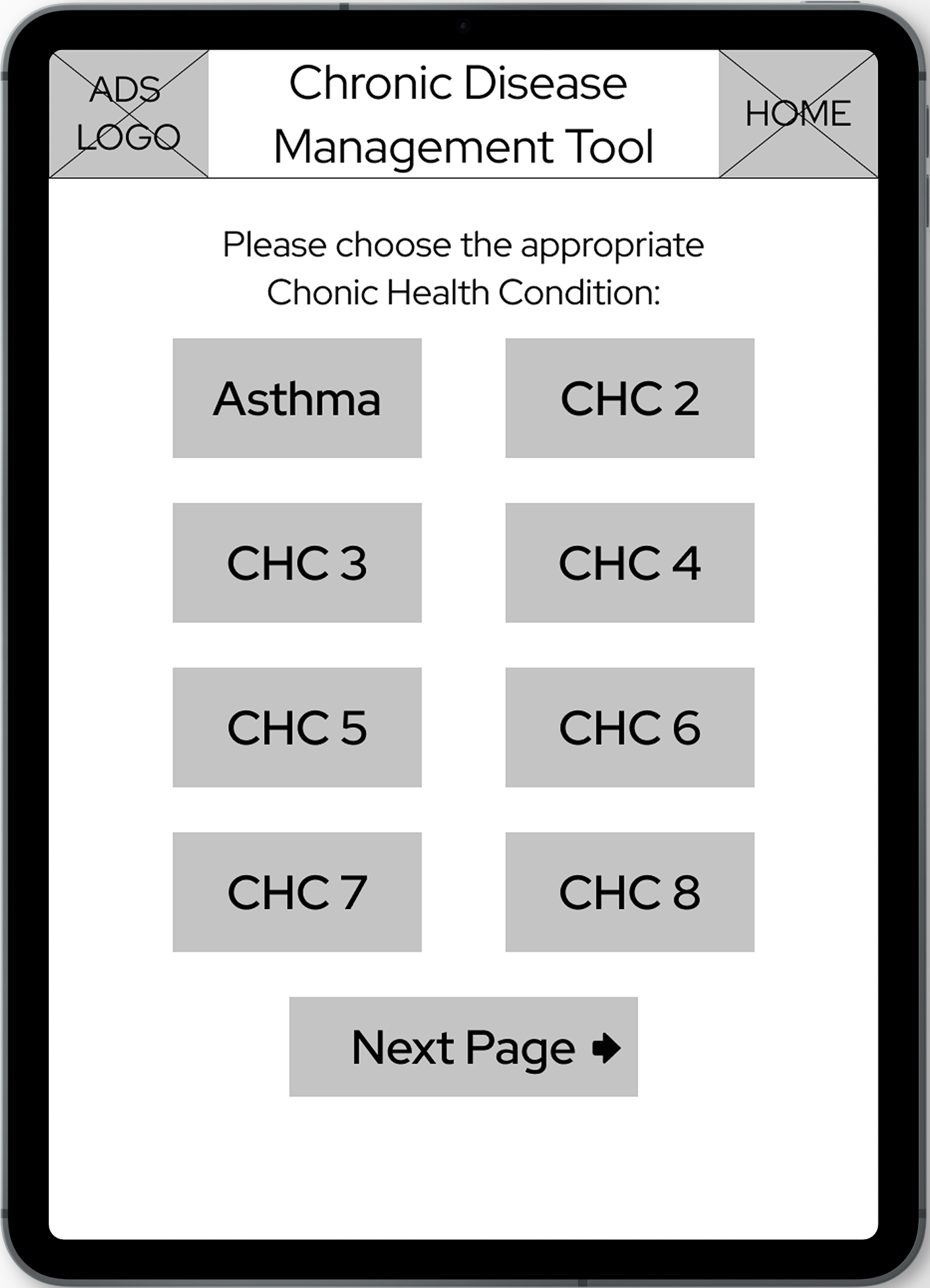
Digital Wireframes
As I moved into the digital design phase, I made sure to base my screen designs on initial user research and stakeholder feedback.
Usability Study Findings
I conducted two rounds of usability studies and in each round key performance indicators were measured:
Task Success Rate (Generating a health status report)
System Usability Scale (Provided after completing the task)
The usability study helped guide and refine the designs as I moved from wireframes to mockups.
Round 2 Findings
Users wanted language options
Users were comfortable using the application without technical assistance
Round 1 Findings
Users wanted a search option
Users were unsure how to proceed if they didn’t have an answer
Users wanted text size adjustment
Improving the design
Mockups
After conducting the usability studies, I focused on navigation, reducing error potential, and readability. Using larger-sized buttons with high contrast allowed users to successfully identify and select the appropriate chronic condition. I also added a search option and accessibility functions that would remain static throughout the user’s journey.


Accessibility Considerations
1. Contrast
Using contrast that meets WCAG guidelines for text and user interface components provides access to users with low vision.
2. Icons
Recognizable icons combined with text are used to help users identify available actions.
3. Button Sizing
Buttons were sized for ease of identification and click/tap actions to help users with impaired vision and motor function.
Refined Designs


High fidelity Prototype
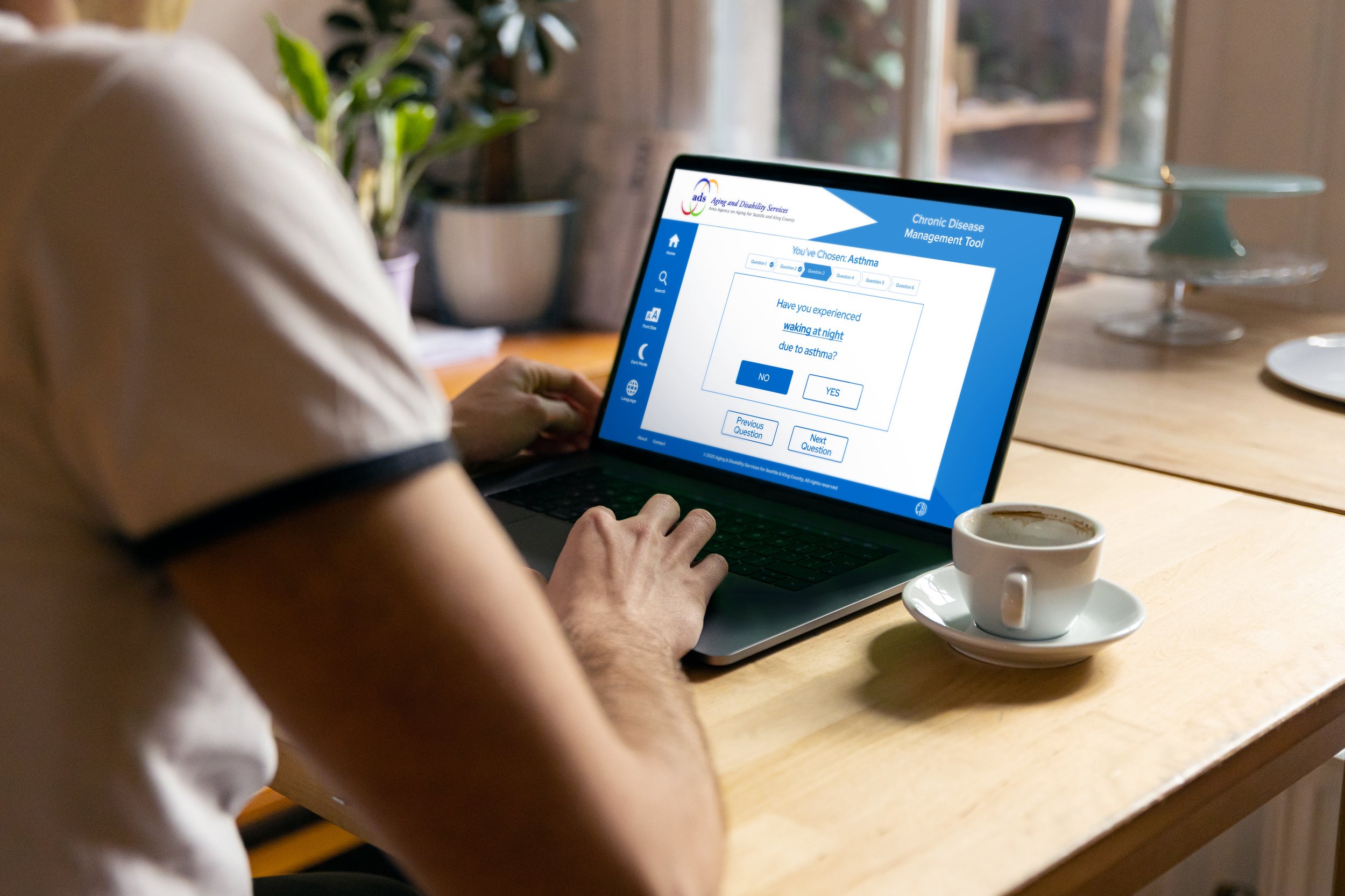
The final high fidelity prototype provides the user flow for completing the chronic disease self-assessment.
View the ADS Chronic Disease Management Tool High Fidelity Prototype.

Takeaways
Impact
The Chronic Disease Management Tool affords users to assess the management of their chronic condition and feel in control of their health. Furthermore, the ability to generate a health status report allows the user to include themselves in the conversation with their health care providers.
Growth
This project allowed me to utilize and further develop my skills and take ownership of the designer role. The challenging nature offered insight into the strengths and weaknesses of my design process and where I can direct my focus on improvement.
What I learned
While designing the Chronic Disease Management Tool, I learned the importance of utilizing usability studies and feedback to guide the iteration process of my designs and making sure user needs are met.
Professional Development
As a real-world project, I had the opportunity to meet and work with ADS stakeholders in their Seattle office. Engaging with product owners, developers, and users provided valuable insight and learning opportunities.