

Seattle Sustenance
Helping Seattle’s citizens in need fight food insecurity.
Project Overview
Duration
10 Weeks (Remote)
Team
Project Manager
UX Designer
2 Developers
My Role
UX Designer
2 Developers
UX Designer
UX Researcher
Tools
Figma
Figjam
Adobe Photoshop
Zoom
Responsibilities
User interviews
Conducting usability studies
Paper + Digital Wireframes
Low and high-fidelity prototyping
Figjam
Adobe Photoshop
Zoom
User interviews
Conducting usability studies
Paper + Digital Wireframes
Low and high-fidelity prototyping
The ProblemSeattle's citizens in need face a serious challenge overcoming food insecurity. While meal services within the city exist they can be difficult to identify and locate.
The OpportunityDesign a resource of information that helps Seattle's citizens find appropriate meal services.
The SolutionA mobile application provided by the City of Seattle that would offer discovery and navigation to suitable meal services for citizens in need.
Design a resource of information that helps Seattle's citizens find appropriate meal services.
The SolutionA mobile application provided by the City of Seattle that would offer discovery and navigation to suitable meal services for citizens in need.
Understanding the problem
During the discovery stage I conducted research to better understand the problem of food insecurity; how it was prevalent across the city and citizens it impacted most.

Understanding the user
To better understand our users I conducted interviews and created empathy maps that would guide my designs and make sure I was addressing their needs. A user group identified early on was young working adults who lived alone and their earned income was at or below the poverty line.
This user group confirmed our assumptions that often times meals had to be sacrificed in order to meet other obligations such as housing or public transport.
Persona Perspective: “Got off work late and I need dinner…but rent is due soon.”

Pains
Stressed
Angry
Fear of starvation
Fatigued
Working late makes it harder to find meals
Gains
Got the name of a local church offering meals
Late night bus service is free
Saw signage about a local soup kitchen and when they serve
Found a local pizza place that was giving away some unsold pizza before closing.
Ideation + Wireframes
I conducted some ideation exercises and began drafting sketches of the app on paper. My goal was to explore elements that would address user pain points and make sure the well suited elements made it to the digital wireframe process.

Determining Filter Options

Early paper sketches
Digital Wireframes
As the design phase continued, I made sure to base my screen designs on findings from research. Simple navigation and flow was a key user need to address during the design stage and would be measurable in usability studies.


Usability Study Findings
Two rounds of usability studies were conducted. Findings from the first round assisted in iterating my designs from wireframes to mockups. The second study was done using a high-fidelity prototype that revealed what aspects needed further refining.
Round 1 findings
Users were frustrated that the zip code option wasn’t accurate relative to location.
Users were confused between choosing meal-type vs. meal time.
Users wanted the option of entering an address.
Round 2 findings
Users wanted hours on the results listing
User wanted turn-by-turn style directions (Navigation familiarity)
Refining the design
Mockups
Insight provided by the usability studies allowed me to customize my early wireframes and refine my designs. I added additional options and revised others to meet user needs and streamline the flow.


Refined Designs
High Fidelity Prototype
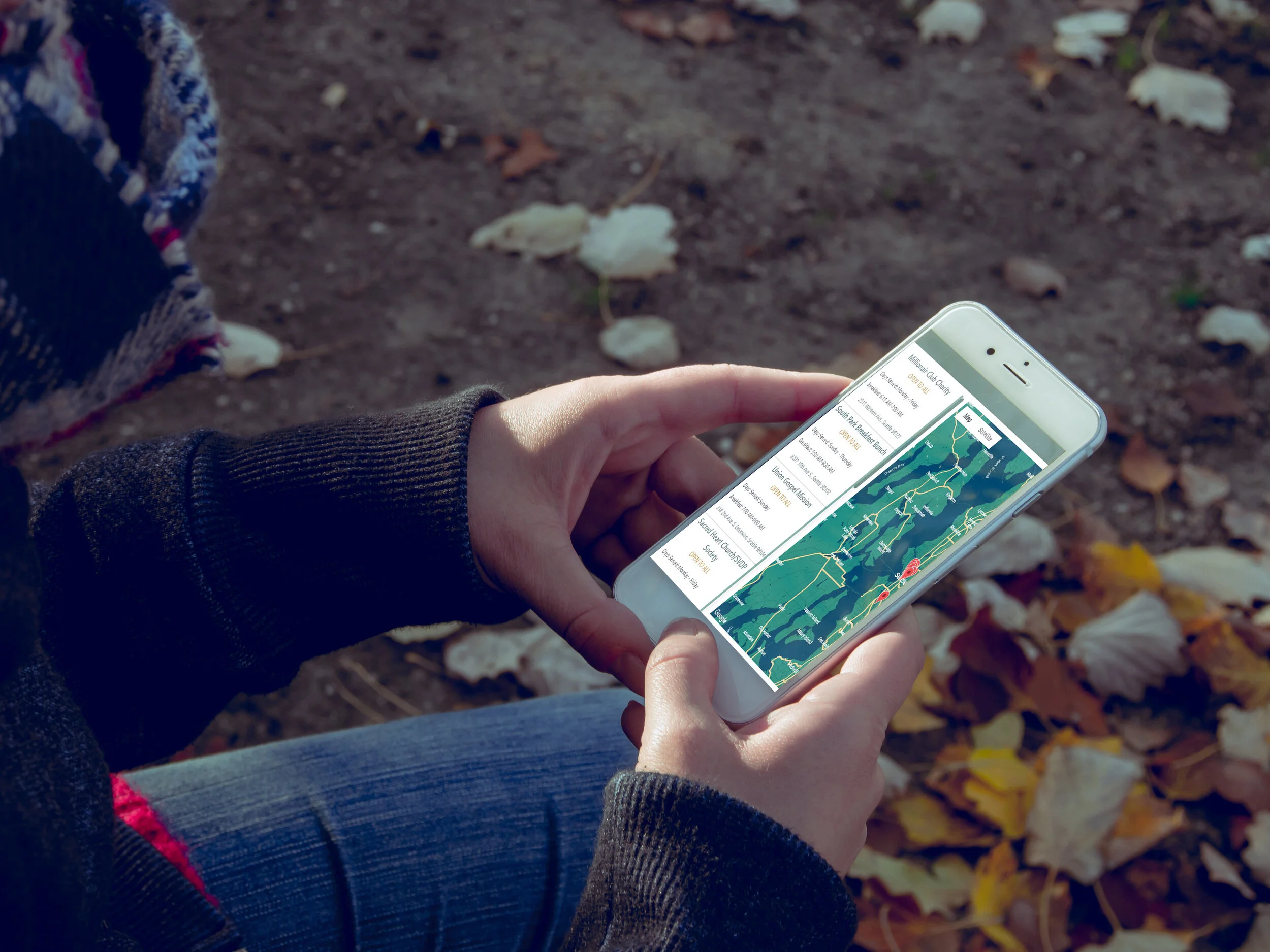
The final high-fidelity prototype presents the user flows for finding an appropriate meal and getting navigational instructions to the location. The qualifying selections ensure that the user will only receive meal solutions suitable for them.
The high-fidelity prototype for Seattle Sustenance can be viewed here.
Going forward
Impact
The Seattle Sustenance app will help our target users facing food insecurity by guiding them to suitable meal locations. Our target users can use the app to quickly and effectively attain their goals and mitigate a serious point of anxiety.
What I learned
I learned the importance of identifying the user’s problem and the points of pain within. Doing so provides a clear picture of the user’s needs that I can use to ideate and start designing solutions.
Next Steps
1. Testing
I will conduct more rounds of usability testing to validate whether experienced pain points have been effectively addressed. This step is a priority for the app to make sure I am meeting user needs and not creating additional obstacles towards their goals.
2. Research
Conduct further research to determine and new areas of need or additional features that can either improve quality of life or reduce the time it takes to get the desired result.